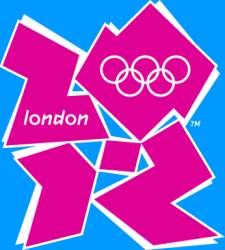
New London Olympics Logo
 The image on the left is the new logo for the 2012 London Olympics, unveiled today. Its been getting the big sell from the government and the London Olympic organizing committee whose chairman Lord Coe says ‘it is different, exciting and it really defines us as a city, a country and an organisation.’ He goes on ‘It meets the biggest challenge we have over the next five years, which is reaching out to young people.’
I must be on a completely different wavelength to young people because it doesn’t say any of that to me, if I didn’t know it was the Olympics logo apart from the obvious rings it could represent anything.
Apparently it took a year to design this logo which International Olympic Committee President Jacque Rogge says ‘is a truly innovative brand logo that graphically captures the essence of the London 2012’, and not to be outdone Olympics Minister Tessa Jowell called it ‘an iconic brand.’ All of which makes me think designing logos must be fairly easy, a couple of afternoons messing about with some graphics program then its all down the pub.